
Expanding the Herd.
Rebrand for COWS
Project Context
This student project focused on rebranding COWS, a well-known ice cream brand, with the goal of modernizing its visual identity while keeping its playful and nostalgic personality.
The project was completed independently and explored how branding could be applied consistently across packaging, digital platforms, and in-store experiences.
Timeline
1 week
Background
An iconic brand losing clarity and consistency.
COWS has a strong and recognizable identity, but its visuals felt outdated and inconsistent across different touchpoints. Packaging, digital presence, and in-store branding did not fully align, making the brand feel less cohesive and less engaging for newer audiences. The challenge was to modernize the brand while preserving its charm and familiarity.

The Problem
COWS has a strong identity, but its visuals felt outdated and inconsistent across packaging, digital, and in-store experiences. This made the brand less cohesive and less engaging for newer audiences. How might we modernize the brand.
Process
Research
I started by analyzing COWS’ existing branding, focusing on packaging, typography, and digital presence. I also looked in person at competitor brands and current trends in food and beverage design to understand how playful brands maintain clarity while staying visually engaging. This helped identify gaps in consistency and opportunities to simplify the overall system.
Design
Tool(s) Used:
Adobe Photoshop
I started off with some simple sketches. The original logo, although colourful with many assets, keeps the cow shape built of simple geometric shapes. With that in mind, I wanted to ensure my rebrand would keep the simplicity.
ITERATION
01.
This was initially my strongest direction. As seen in the sketches, I explored multiple flavor variations using this concept and really liked the idea of turning the cow’s bell into the “O” in the wordmark.
However, the design had a few issues. Without strong color cues, the cow shape became less recognizable and started to resemble a dog. It also leaned too heavily into a childish tone. While COWS is playful, this direction didn’t capture the nostalgic, tourist-driven charm of the brand and instead felt overly kid-focused.
ITERATION
02.
This was initially my strongest direction. As seen in the sketches, I explored multiple flavor variations using this concept and really liked the idea of turning the cow’s bell into the “O” in the wordmark.
However, the design had a few issues. Without strong color cues, the cow shape became less recognizable and started to resemble a dog. It also leaned too heavily into a childish tone. While COWS is playful, this direction didn’t capture the nostalgic, tourist-driven charm of the brand and instead felt overly kid-focused.

ITERATION
03.
This iteration was the one I felt most confident in. I realized I was overcomplicating the earlier concepts, so I went back to a simpler sketch and rebuilt from there. Removing the outlines helped the design feel much cleaner and more refined, while still keeping the brand recognizable.

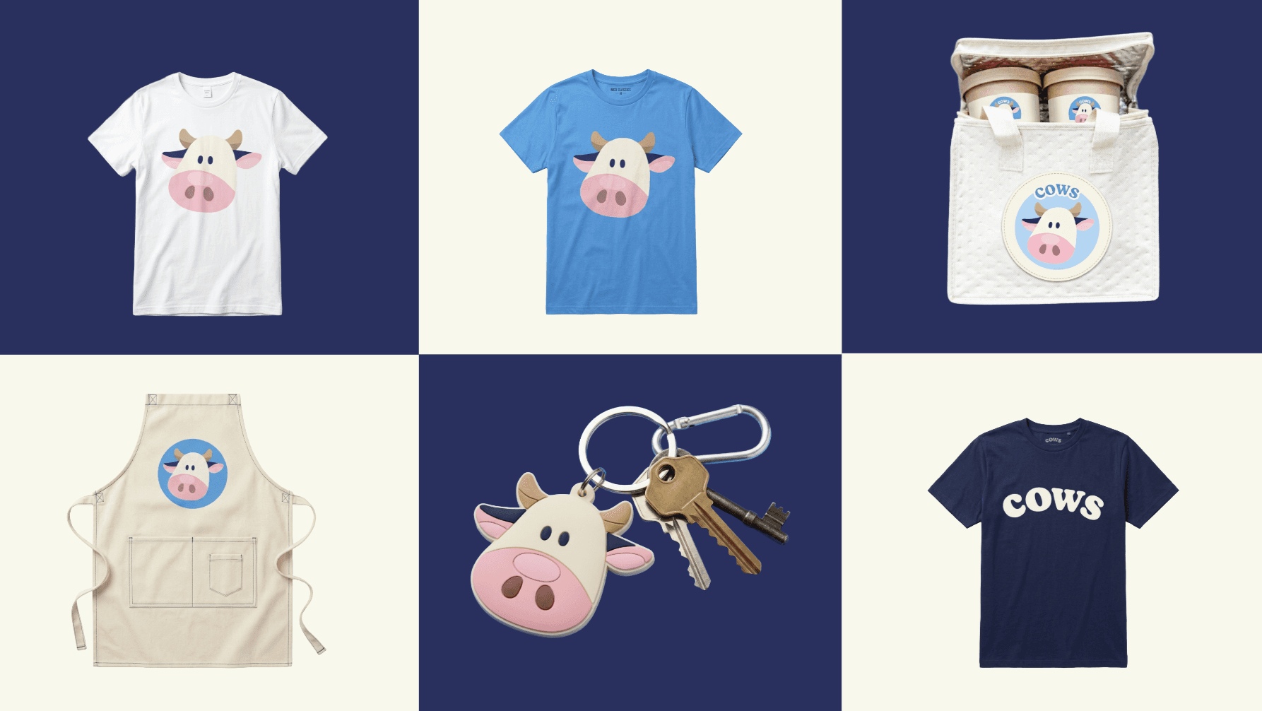
Final Design & Mockups


Key Takeaway
Strong branding comes from knowing what to simplify and what to preserve
Some of the strongest decisions came from pulling back and focusing on what actually mattered for the brand. By refining and removing excess, the identity became clearer, more cohesive, and easier to recognize while still holding onto its personality.